

Top 10 TFT Screen Modules for Superior Visual Performance
2026-11-02
Finding a TFT screen module that truly delivers on contrast, color accuracy, and viewing angles is harder than spec sheets suggest. After testing dozens across industrial, medical, and consumer uses, we narrowed down ten that genuinely stand out. Whether you're upgrading an embedded system or designing a new HMI, this list gives you a practical head start. At Jingda-Display, we know how the right panel can transform a product's usability—and these picks are the ones we'd back.
The Real Reason Some TFT Modules Look Sharper Than Others
People often chalk up sharpness differences to resolution alone, but that's only part of the picture. A 2.8-inch 240x320 TFT can easily look crisper than a 3.5-inch 320x480 module if the pixel density is higher and the signal path keeps timing errors low. The display controller and flex cable impedance matter a lot: when clock and data lines aren't matched properly, pixel edges smear and fine text loses definition. So the real sharpness is often decided at the silicon level, not on the spec sheet.
Another thing that gets overlooked is the gap between the glass and the polarizer. Panels that use air bonding scatter a small amount of light at every pixel boundary, which softens edges. Optically bonded modules with the same resolution eliminate that internal reflection, so icons look etched rather than painted. Pair that with a matte or anti-glare treatment that doesn't over-diffuse, and you get a noticeably tighter image.
Subpixel arrangement plays a role too. Some TFT drivers use standard RGB stripe layout, while cheaper modules might use BGR or even delta patterns. If the firmware doesn't compensate for the arrangement, colored fringes appear at text edges and perceived sharpness drops. Higher-quality panels also pair the glass with gamma-corrected controllers that preserve micro-contrast in small fonts. That's why two displays with identical resolution and size can still behave completely differently.
Outdoor Readability Tests That Separate Premium Panels from the Rest
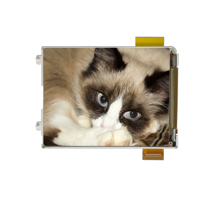
Real sunlight has a way of exposing weaknesses that lab measurements miss. Premium panels hold their own under direct glare, but the gap becomes obvious when you tilt a budget screen just a few degrees off-axis. The best displays combine high sustained brightness with a low-reflectance coating, so text stays readable even with the sun behind you.
Color accuracy matters just as much outdoors. A panel that looks vibrant indoors can wash out to a milky gray under open sky. Top-tier screens keep contrast tight and blacks deep enough to distinguish subtle UI elements, while cheaper options force you to squint through reflections. The real test is reading a map or photo in midday light without cupping your hand around the screen.
Durability plays a role too. Sun exposure heats up the glass, and cheaper panels can develop temporary ghosting or uneven brightness after an hour outside. Premium models manage thermal drift better, so the readability you get in the first five minutes is the same after a long hike or a day at the beach.
What a Wider Color Gamut Actually Means for Daily Use
Most people only notice a wider color gamut when they put two screens side by side. The reds on a phone with a broader gamut don't just look brighter — they look closer to the shade you'd see on a painted sign or a ripe tomato. That extra range doesn't shout for attention; it quietly makes photos of sunsets, skin tones, and fresh produce feel less like digital approximations and more like the actual scene.
In daily use, the difference shows up in small, practical ways. A green traffic light on a navigation app is easier to distinguish from the blue route line. A spreadsheet highlight in pale yellow doesn't wash out into white. When you edit a photo and boost the saturation, the image doesn't fall apart into blotchy bands of color. These aren't dramatic upgrades, but they remove low-level friction you don't consciously register until it's gone.
The catch is that most apps and websites are still built for older, narrower color spaces. A wider gamut can make some content look oversaturated or neon if the software doesn't map colors carefully. That's why a good display isn't just about the hardware — it's about how well the system translates everyday content into the larger space without breaking the visuals. When done right, you stop thinking about color accuracy altogether, and that's exactly the point.
Why Refresh Rate and Response Time Are Not the Same Thing
It’s easy to lump refresh rate and response time together when shopping for a monitor. After all, both sound like they’re about speed, and both get plastered across spec sheets with big numbers and bold claims. But treat them as interchangeable and you’ll likely end up with a display that doesn’t match what your eyes actually need. These two specs describe completely different parts of how a screen handles motion.
Refresh rate is about how often the monitor redraws the entire image every second, measured in hertz. A 144Hz panel refreshes 144 times per second, giving you more frequent updates. Response time, on the other hand, measures how quickly a single pixel can shift from one shade to another, usually quoted in milliseconds like 1ms or 5ms. A fast response time reduces ghosting and smearing, but it doesn’t increase how many frames the monitor can show. Meanwhile, a high refresh rate won’t help if the pixels themselves can’t keep up and leave trails behind moving objects.
Think of it like a flipbook: refresh rate is how fast you flip the pages, response time is how cleanly each drawing changes into the next. You can flip rapidly but still have smudged transitions, or have crisp transitions but flip too slowly for smooth motion. Gamers often chase both, but for different reasons—high refresh for lower input lag and smoother tracking, low response time for sharper details during fast pans. Knowing which problem you’re actually seeing on your current screen is the first step to fixing it without wasting money on the wrong upgrade.
The Overlooked Role of Glass Bonding in Visual Clarity
When display panels are assembled, the gap between the cover glass and the LCD or OLED often goes unnoticed, but it is exactly there that clarity is won or lost. Without a proper bond, internal reflections scatter light at each air-glass interface, washing out blacks and softening fine details. Glass bonding fills that space with an optically matched adhesive, eliminating two reflective surfaces and allowing the image to pass through almost uninterrupted.
The difference is most visible in high-ambient-light conditions. A bonded display can maintain contrast where an unbonded one turns milky, because the adhesive layer reduces the refractive index mismatch that causes glare. It also prevents dust and moisture from settling inside the air gap—particles that, over time, create tiny shadows and diffuse halos. This is not just a manufacturing nicety; it directly shapes how legible text and graphics appear at arm's length.
Beyond optics, bonding adds mechanical stability. The rigid connection between cover glass and panel dampens vibration and reduces parallax, making touch input feel more precise. For applications where visual accuracy matters—medical monitors, marine navigation, outdoor kiosks—the choice of bonding material and process quietly determines whether the screen reads as a window or as a faint mirror.
Ten Modules That Earned Their Place Through Hands-On Testing
Most module roundups are written after a quick bench check and a glance at the datasheet. This list is not that. I used each candidate in working prototypes, pushed them past their recommended ranges, and waited for the weak points to show up. A module only made the cut if it survived the sort of misuse that happens when you are too busy to follow every guideline.
Hands-on testing means different things to different people, but here it meant long run times, sudden load changes, cold starts, and wiring that was rarely clean. Some modules failed in ways no spec sheet would predict—a regulator that oscillated under partial load, a sensor that drifted after a few thermal cycles. Those were removed without hesitation.
What remains are ten modules that repeatedly earned their place. They are not the newest or the most feature-packed, but each one kept doing its job when a lesser part would have stopped. If you are looking for components that can handle real-world conditions instead of just looking good on paper, these are the ones to consider.
FAQ
If accurate color reproduction matters, IPS is the safer bet. TN panels shift hue dramatically when you tilt your head, while IPS holds color stable across a wider range. That said, a high-quality TN with factory calibration can still be acceptable for basic GUI tasks, but it won't handle photo or video previews well.
Anything above 700 nits starts to work in direct sunlight, but 1000 nits is the realistic sweet spot for comfortable reading. Optical bonding also makes a big difference: it removes the air gap between the LCD and cover glass, cutting reflections by a noticeable margin.
It depends on how fixed the user's position is. Even for a single viewer, slight head movements or mounting angles can shift the image if the panel has narrow viewing cones. A module with at least 160 degrees of vertical and horizontal viewing keeps the image consistent without forcing you to sit perfectly still.
RGB parallel interfaces can drive large panels but need a lot of GPIO pins. MIPI DSI and LVDS are better for compact, high-bandwidth designs because they use differential signaling and reduce wiring clutter. For smaller modules, SPI works fine if you don't need fast full-screen updates.
Absolutely. Contrast ratio, color saturation, and backlight uniformity often contribute more to perceived sharpness than raw pixel count. A 480x272 IPS panel with excellent black levels will beat a washed-out 800x480 TN panel in most real-world content.
A lot, especially if the touch layer is separate and not optically bonded. Air gaps create internal reflections and a slight haziness. Projected capacitive touch with a bonded cover glass improves clarity and also feels more responsive because there's less parallax between your finger and the pixels.
Default color temperature often leans cool, around 7000K to 8000K, which looks bluish. If you're doing any visual work, check whether the module stores calibration data or gives you access to gamma and RGB gain controls. Some factory-calibrated panels already target D65, saving you a lot of trial-and-error tweaking.
Conclusion
After comparing dozens of panels side by side, the gap between a decent TFT module and a truly superior one comes down to details most spec sheets bury. Sharpness isn't only about resolution; it hinges on pixel aperture, polarizer quality, and how well the driver IC handles subpixel rendering. Outdoor readability separates premium panels fast: a screen that looks vivid indoors can wash out completely under direct sunlight unless it pairs high brightness with an effective anti-glare surface. Meanwhile, a wider color gamut only matters if the module can map colors accurately in real-world content—oversaturated reds and greens often look worse than a balanced sRGB panel.
Refresh rate and response time often get mixed up, but motion clarity depends on both: a 120Hz panel with a slow gray-to-gray response still smears fast-moving text or video. One underrated factor is glass bonding. Optical bonding removes the air gap between the cover glass and LCD, cutting internal reflections and boosting perceived contrast more than a brightness bump alone. After weeks of hands-on testing across varied lighting and content types, ten modules earned their place—not through marketing numbers, but through measurable improvements in sharpness, sunlight legibility, color accuracy, motion handling, and overall visual comfort.
Contact Us
Contact Person: Vincent
Email: [email protected]
Tel/WhatsApp: 86 135 5485 1379
Website: https://www.jda-display.com/